
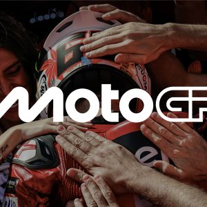
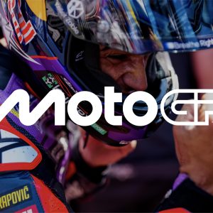
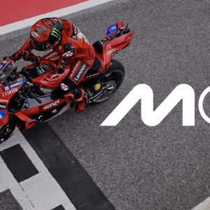
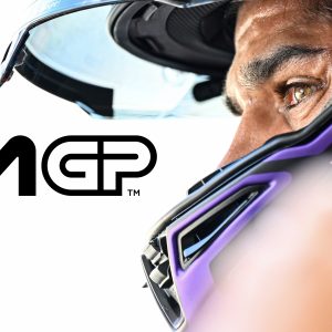
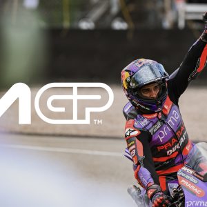
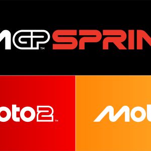
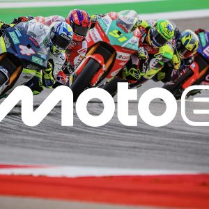
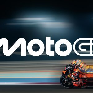
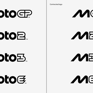
 On the same day that Jorge Martin won the world championship, Dorna Sports revealed a new logo for the premier class and the classes beneath it.
The rebranding by the design studio Pentagram includes new artwork, fonts, and visual and verbal identity.
The new look brings MotoGP into a new era after celebrating its 75th anniversary this year.
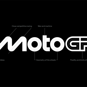
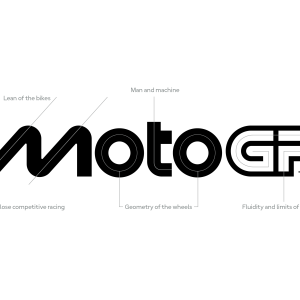
According to Dorna Sports, the “M” in the new MotoGP logo takes inspiration from two bikes leaning close together.
The “O” references wheels and the “T” the rider between them.
“Working on the new MotoGP identity has been an incredible honour,” said Angus Hyland, creative director and Pentagram partner.
“It was great to collaborate with the MotoGP team to reimagine this iconic brand, and impossible not to get caught up in the excitement of the competition and the people that shape it.
“We hope fans around the world will embrace the new look and feel as MotoGP races into its next chapter.”
Carmelo Ezpeleta, CEO of MotoGP rights holder Dorna Sports added: “We’re very excited to reveal our new identity and invite fans around the world to meet the new MotoGP.
“Working with Pentagram has been an incredible adventure leading to what we hope our fans will agree is an incredible result.
“A brand is more than a logo, and MotoGP is more than a sport. The process has taught us a lot about both and we’re very proud to show the world the results.
“The key question throughout has been, ‘What is MotoGP?’, both now and looking forward to who we want to be, and we hope this new identity communicates every aspect of that, from the speed to the passion and everything in between. This is MotoGP.”
















Discussion about this post